The website’s overall laconic design is not without a certain symbolism.
The logo ![]() is a monogram of the letters ilupin with some poetic license as the unrounded p and a central symmetry emphasised on hover.
is a monogram of the letters ilupin with some poetic license as the unrounded p and a central symmetry emphasised on hover.
The arrows ▸ in player style are meant to reflect in unexpected places the author’s reverent attitude toward music in general and song translations in particular.
The hedgehogs  on the homepage subtly allude to the innumerable population of erinaceinae that the author cares for: it so happened historically.
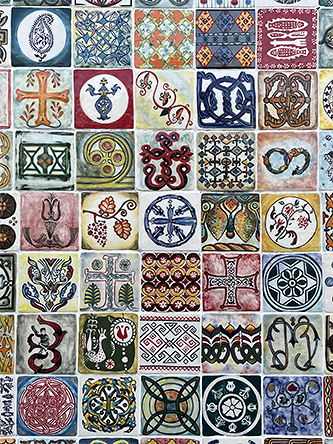
The photos  used to visually design each section and subsection, including this one, were taken by the author in different parts of the planet.
Green and orange are just beautiful.